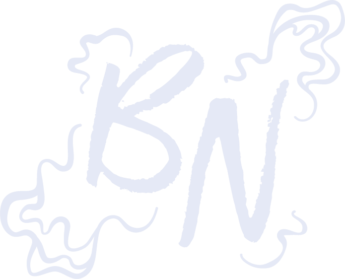
"As It Returns To The Earth" Tarot Cards
Created as a semester-long honor’s project, this set of tarot cards depicts the Major Arcana; 22 out of the 78 cards that make up a full tarot deck. The imagery depicted in a monoline style includes an animal skull and flower in compositions that symbolize the pre-established meanings of each card.
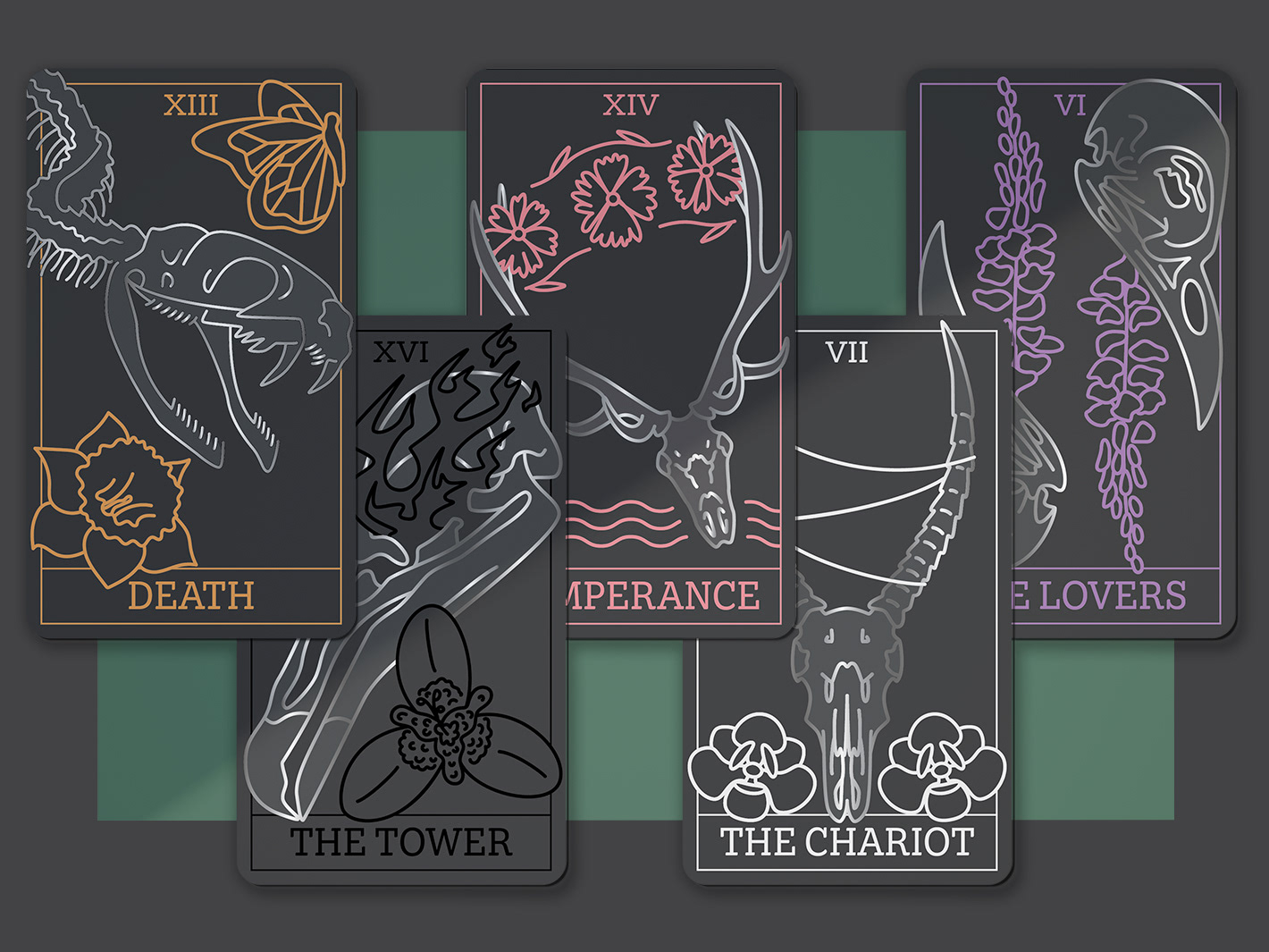
Native: Elemental - Brand Booklet
This fictional campaign represents Native’s core values of being derived from the earth. This language is supported by the use of elemental symbols throughout the multi page booklet, meant to act as a mailer with information about the brand, the campaign, and the products they offer.
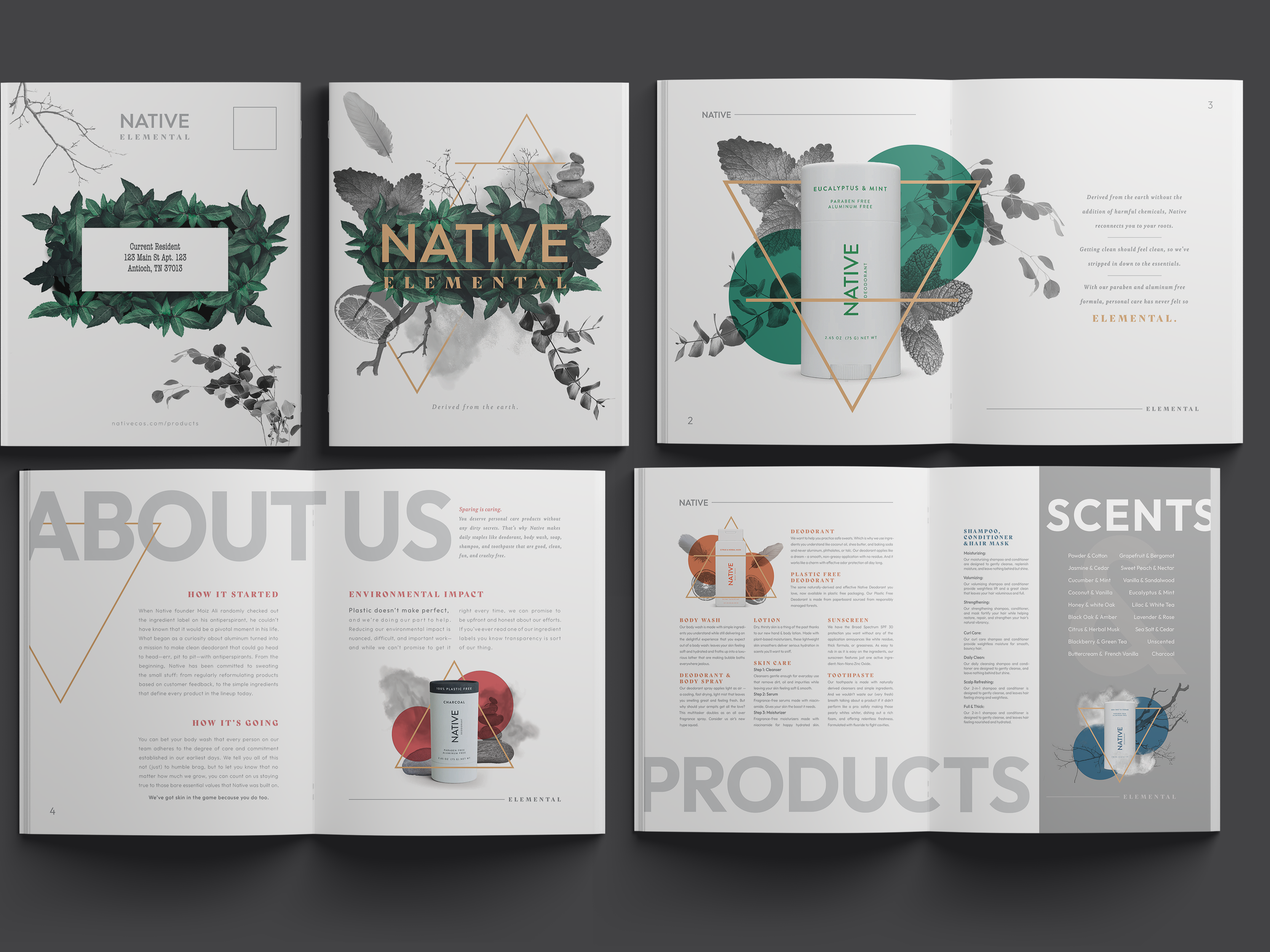
AMUA Merch
A series of designs intended for print on a variety of promotional items for the school “Academy of Make Up Arts” in Nashville, TN. The school focuses on teaching Beauty Makeup, SFX Makeup, Wig Making, Costuming, and various skills realted to these core topics.
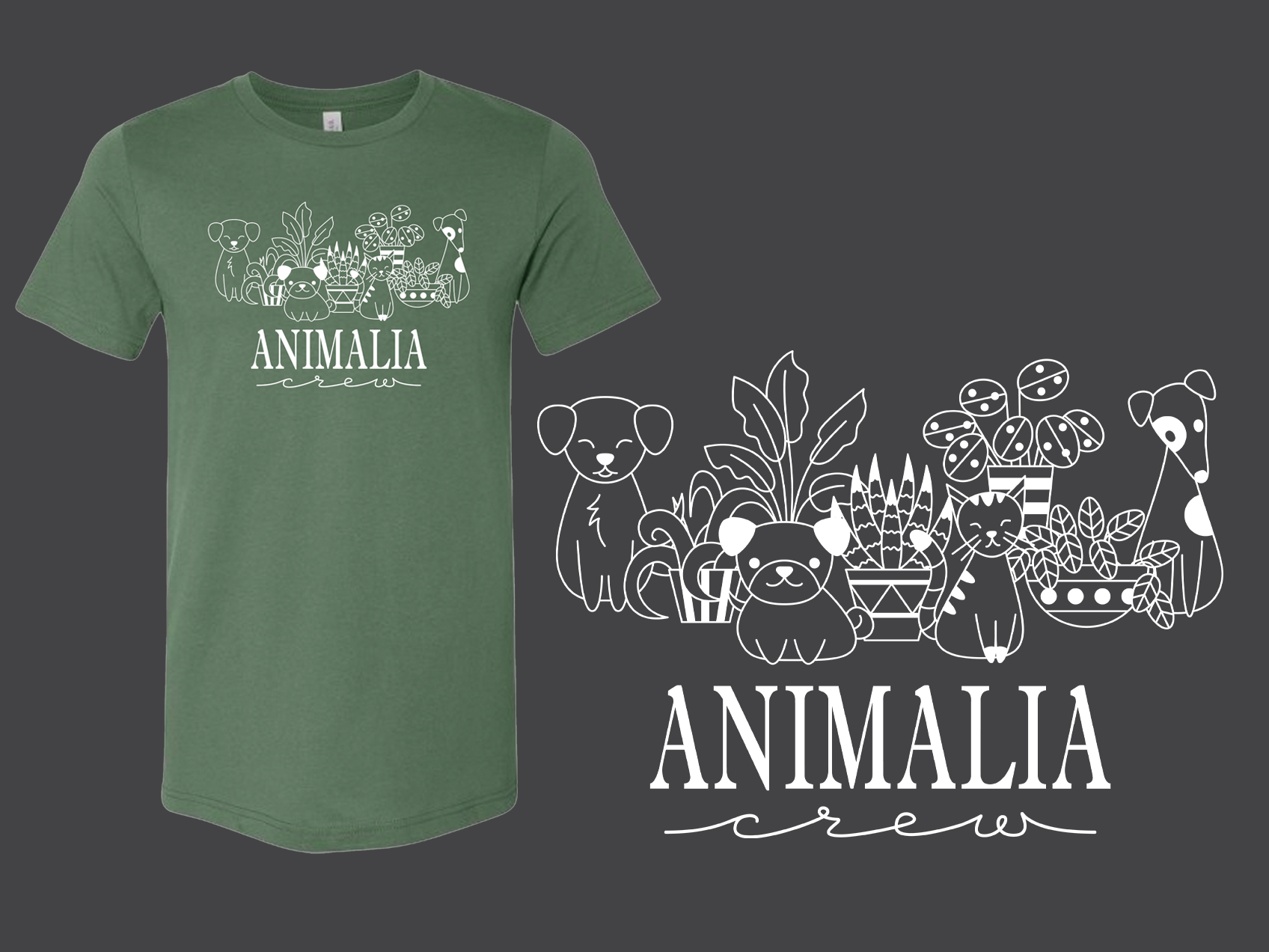
Animalia Shirt Design
Animalia Health & Wellness is a Veterinary clinic in Williamson County, Tennessee that was in need of a design for “Crew” shirts for their staff. It was expressed that a majority of the staff also shared a love for houseplants and requested that this was reflected in the shirt design.
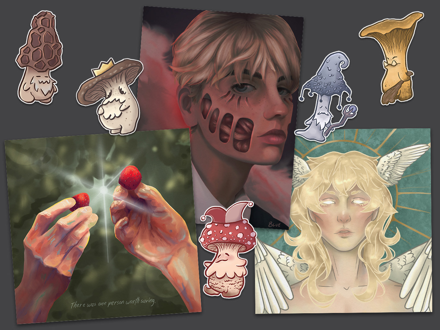
Illustration & Digital Painting
A collection of personal artwork ranging from stylized illustration to realistic digital painting. the range of work displays exploration with color, emotion, stylization, conceptual work, character design, fine detailing, and more.
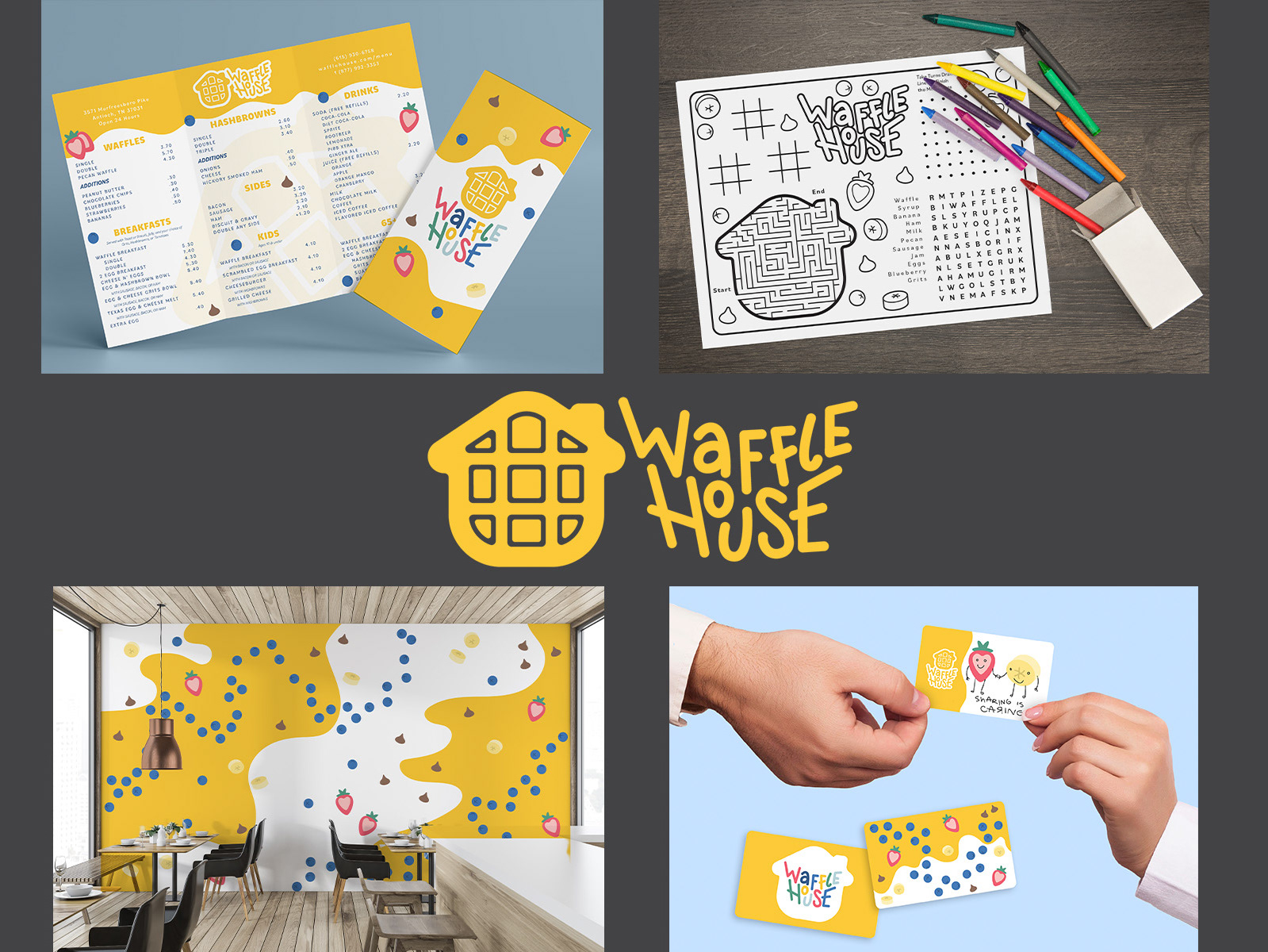
Waffle House Branding
A rebranding of the company “Waffle House,” pivoting toward a more family friendly approach. A cohesive system of branding elements were created to achieve this, including: a new logo, a logo system, menu design, kid’s coloring menu, interior wall design, multiple gift card designs, and employee uniforms.
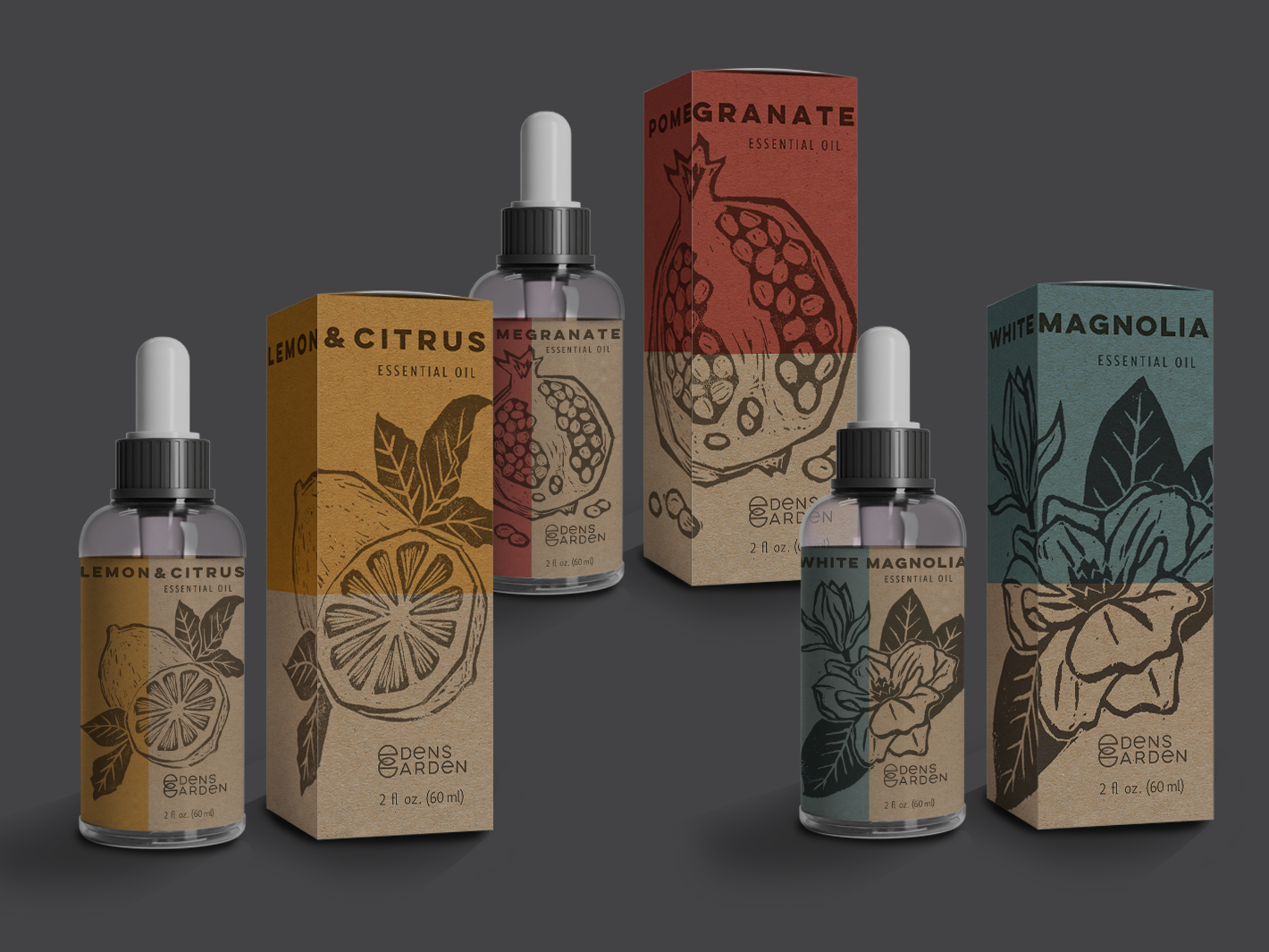
Edens Garden Packaging
This series includes the bottle and box packaging for Edens garden essential oils utilizing linocut elements to display three different scents with corresponding imagery and color variations. The brand’s logo was also redesigned to better scale and fit with the themes of the packaging.
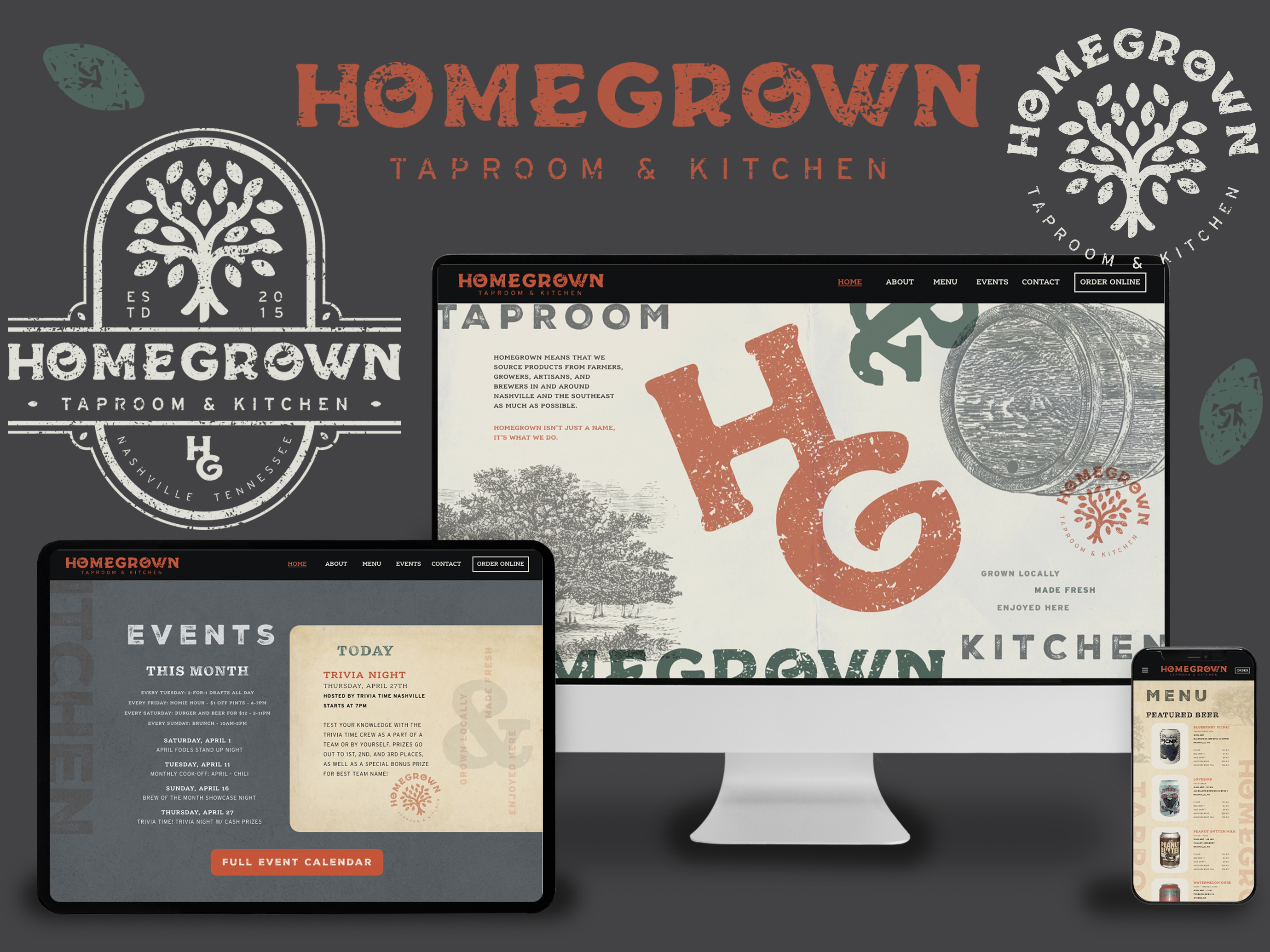
Homegrown Taproom Branding
A full logo system and responsive website design for the local bar Homegrown Taproom & Kitchen. Since they pride themselves on being locally grown/crafted and supporting local companies, the rebranding focuses on a handmade look and feel. The webpage design is supported by vintage letterpress themes and is reformatted to fit both tablet and mobile.
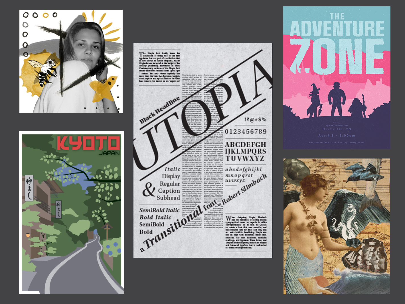
Posters
A collection of multiple one-off or small series’ of poster work highlighting illustration, collage, type treatment, layout, gridwork, and asset creation. Each work or series focuses on a facet and explores layout and hierarchy. All projects with multiple posters also delve into creating cohesion in a line of designs while also creating interest in the differing elements.
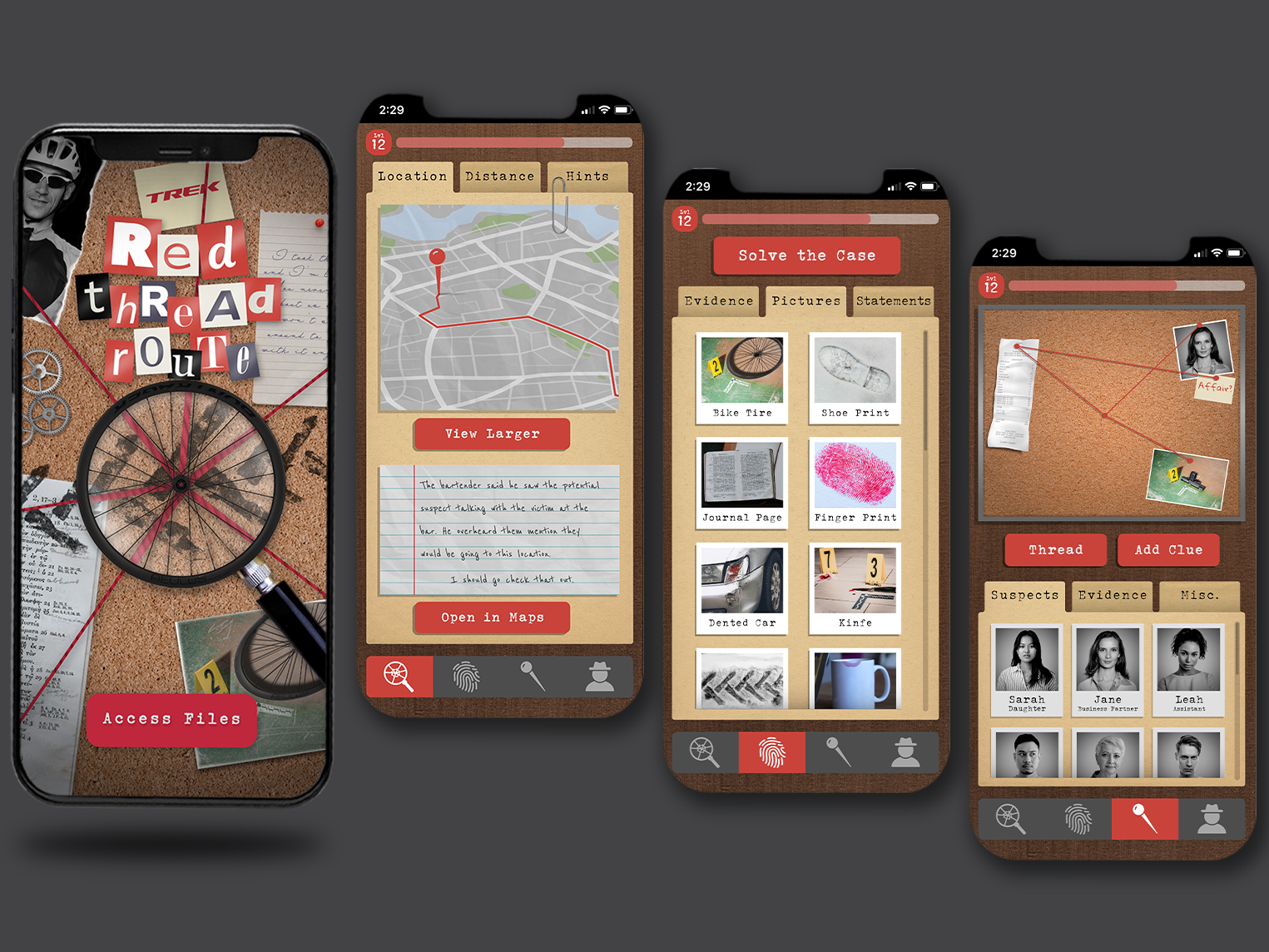
Trek "Red Thread Route" App
Using a hypothetical concept for the biking brand Trek, Red Thread Route utilizes the GPS of your phone in conjunction with a bike wheel attachment to track your miles and/or location in the murder-mystery-meets-geocaching style mobile game.
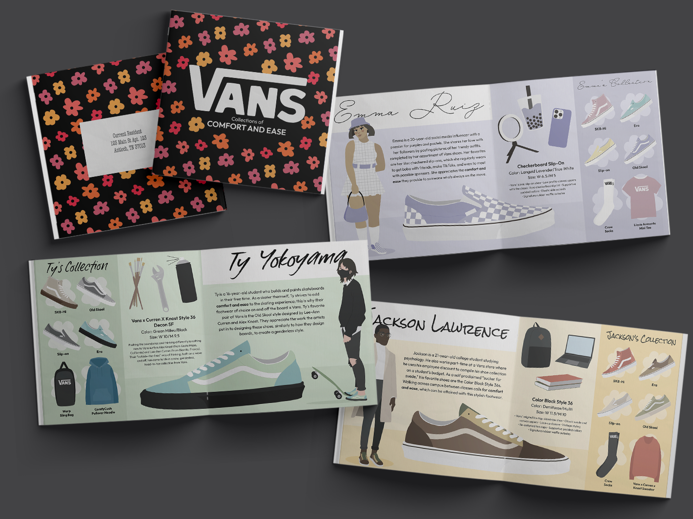
Vans Advertising
This campaign includes a three spread “style guide” booklet that creates three personalities and details their collections. This utilizes a flat color illustration style that is then replicated in the motion graphic that creates yet another personality as they go through their morning deciding which shoes to wear for the day.
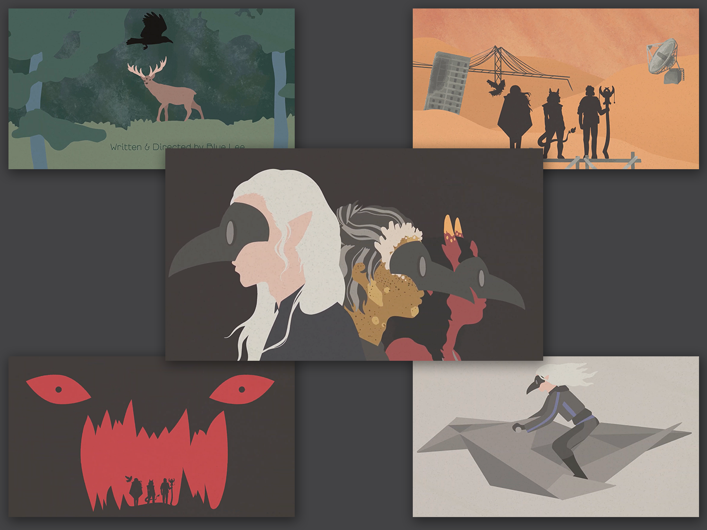
Recovery Title Sequence
A motion graphic created for the hypothetical "Roll+" podcast's Dungeons & Dragons campaign that centers around post-apocalyptic bounty hunters. Timed to music, the title sequence showcases the three main characters in a flat illustrative style.